The responsive design for mobile and tablet is decided at the time of coding and by the development team in order to be responsive and have proper access to different parts of the site. Google principles and standards are also observed. Regarding the responsive design for mobile and tablet at the time of coding And it is decided by the development team to be responsive and have proper access to different parts of the site and to follow the principles and standards of Google.
Queuing form
Lorem ipsum dolor sit amet, consectetur adipiscing elit, sed do eiusmod tempor incididunt ut labore et dolore magna aliqua. Ut enim ad minim veniam, quis nostrud exercitation ullamco laboris nisi ut aliquip ex ea commodo consequat.
Lorem ipsum
Lorem ipsum dolor sit amet, consectetur adipiscing elit, sed do eiusmod tempor incididunt ut labore et dolore magna aliqua. Ut enim ad minim veniam, quis nostrud exercitation ullamco laboris nisi ut aliquip ex ea commodo consequat.
KABIRMOTORCYCLE
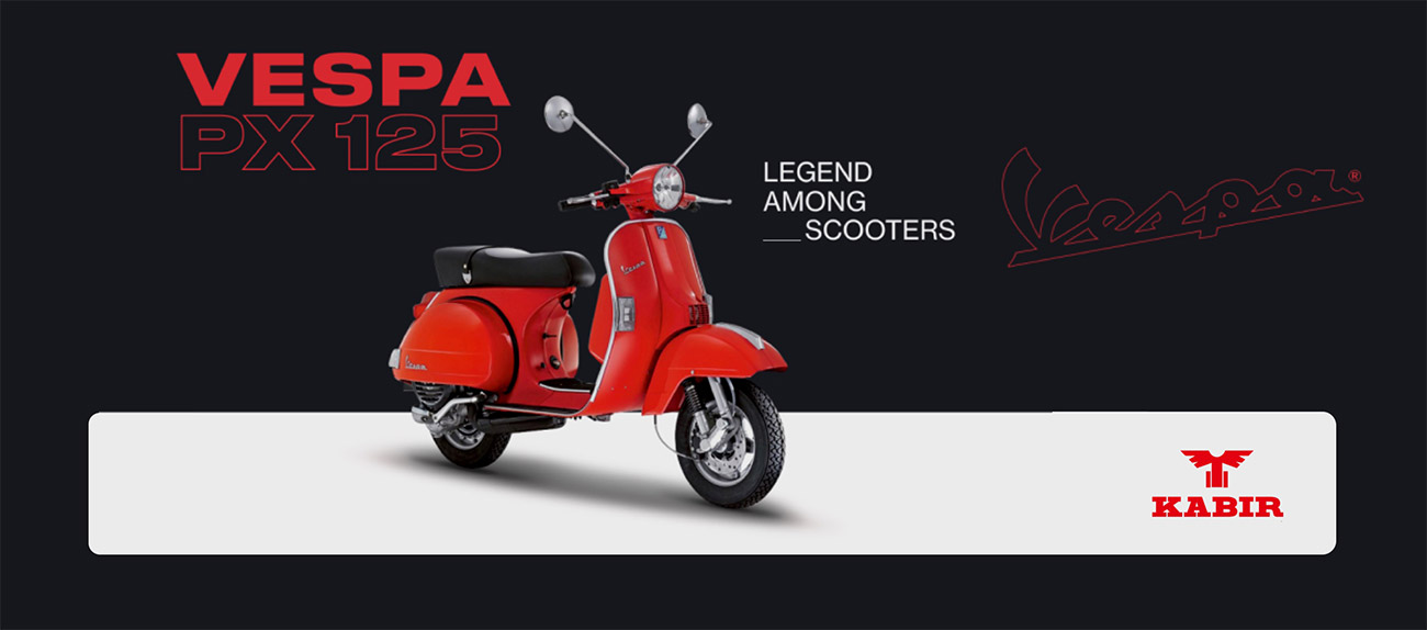
Conditions for obtaining a dealership of Kabir Motor
Form module
The responsive design for mobile and tablet is decided at the time of coding and by the development team in order to be responsive and have proper access to the various sections of the site, as well as the principles and standards of Google.
با ما تماس بگیرید
The responsive design for mobile and tablet is decided at the time of coding and by the development team in order to be responsive and have proper access to the various sections of the site, as well as the principles and standards of Google.
021-88877766021-88877766Learn more about this product
Lorem ipsum dolor sit amet, consectetur adipiscing elit, printer et al. It is practical, many books in the past sixty-three percent of the present and the future, require a lot of knowledge of the community and professionals, to create more knowledge with software for computer designers, especially creative designers, and the leading culture in Persian.
Lorem ipsum dolor sit
Lorem ipsum dolor sit
Lorem ipsum dolor sit
Lorem ipsum dolor sit
Lorem ipsum dolor sit amet, consectetur adipiscing elit, with graphic designers, printers and texts as well as newspapers and magazines in columns and rows as needed, for current technology conditions, and a variety of applications aimed at improving tools. It is practical, many books in the past sixty-three percent of the present and the future, require a lot of knowledge of society and professionals, to create more knowledge with software for computer designers, especially creative designers, and the leading culture in Persian,
Lorem ipsum dolor sit amet, consectetur adipiscing elit, with graphic designers, printers and texts as well as newspapers and magazines in columns and rows as needed, for current technology conditions
Lorem ipsum dolor
Lorem ipsum dolor sit amet, consectetur adipiscing elit, with graphic designers, printers and texts as well as newspapers and magazines in columns and rows as needed, for current technology conditions
Engine specifications
Engine type:
Single cylinder, three valves, i-get technology
Cylinder volume
155cc
Maximum power
8.75 kW (11.9 hp) at 7525 rpm
Fuel specifications
Fuel system
Electronic injector
Pollution level
EURO 4
Lorem ipsum dolor sit amet
The responsive design for mobile and tablet is decided at the time of coding and by the development team in order to be responsive and have proper access to the various sections of the site, as well as the principles and standards of Google.
Lorem ipsum dolor
Reactive design for mobile and tablet at the time of coding and decided by the development team to be responsive and appropriate access to various sections of the site to comply with the principles and standards of Google. Reactive design for mobile and tablet at the time of coding And it is decided by the development team to be responsive and have proper access to different sections of the site and to follow the principles and standards of Google.
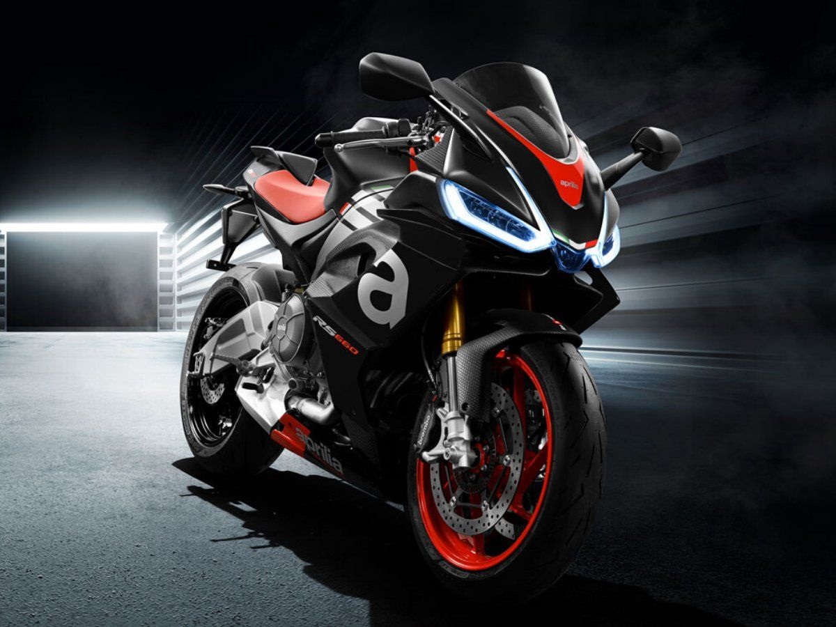
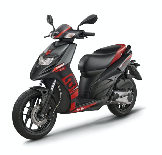
Aprilia engines
Aprilia SR SeriesLorem ipsum
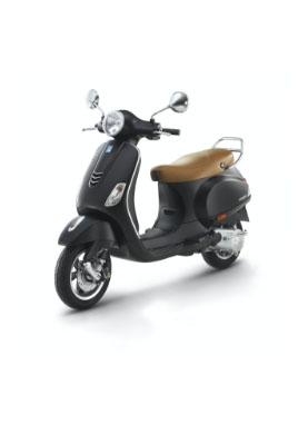
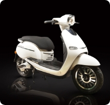
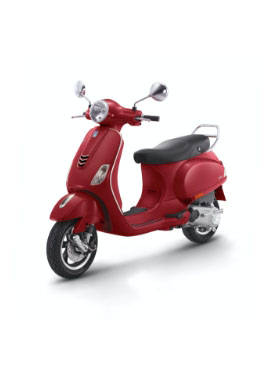
 Vespa VXL150cc SY
Vespa VXL 150 shiny yellow
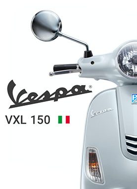
 Vespa VXL150cc SY
Vespa VXL 150 shiny yellow
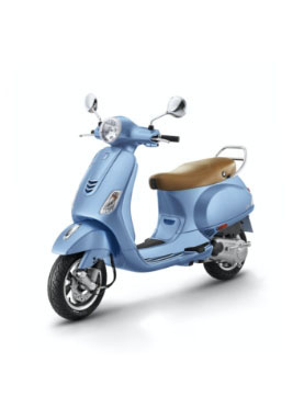
Vespa VXL150cc SYVespa VXL 150 shiny yellow
 Vespa VXL150cc SY
Vespa VXL 150 shiny yellow
Vespa VXL150cc SYVespa VXL 150 shiny yellow
Lorem ipsum
The responsive design for mobile and tablet is decided at the time of coding and by the development team in order to be responsive and have proper access to the various sections of the site, as well as the principles and standards of Google.
Lorem ipsum
The responsive design for mobile and tablet is decided at the time of coding and by the development team in order to be responsive and have proper access to the various sections of the site, as well as the principles and standards of Google.


